Includes the magazine advert for the album on top and then an article on the bottom to create the image of a full page in a magazine. Also we have added a page number and the name of the magazine above, to ensure that we can get a true image of a magazine.
Thursday, 13 February 2014
Tuesday, 11 February 2014
Ancillary (2) - Draft for Magazine article
In case we keep the magazine advert as horizontal, I have done a draft of what the article could look like underneath. It contains part of an interview with celebrity Kendall Jenner, talking about her life. To make it relatable to music, and not just a random celebrity interview, I came up with a 'top 5 favourite songs', that she could of been asked on a real interview that were placed at the side. When the finished product is done, I think I will have added a coloured background to the article, depending on what we use for the background on the whole page, with the advert on. Take note that the magazine advert will be placed on top and stand out a lot more than the interview, to ensure that the purpose of the ancillary task is not taken away. The colours are consistent throughout the article including within the photo of Kendall. This allows to link well with the genre of pop, as you wouldn't see something so bright and pink unless it was in a pop magazine. At the bottom of the page it states 'continued on next page', on a real magazine it would say this if they had to turn over the page to see the rest of the interview, and so in my case, allows the audience to want to know more, and what the rest of the interview would be.
Ancillary Task (2) - Magazine Layout
I have come up with a layout of how the magazine advert will look if we do it horizontally, including a magazine article. This means that I can get a clear idea in my head on where everything will need to be when putting it all together. Below is the layout that I have come up with including what aspects will be included on each part.
Ancillary (2) - Magazine Article Ideas
If we do our magazine advert horizontally, we will be also writing a magazine article to go underneath it, so I can done some research to get some ideas of how to do a layout of a magazine article. Below are a couple of examples of horizontal magazine articles, that I am going to use to gain some inspiration.
I especially like the Nicki Minaj magazine article, as the colour scheme relates to our own that we will be using. Both layouts are excellent, however we would need to make it half the size and it is only going to be half of an A4 page, if we decide to do it horizontally. I also thought that photo below would be good inspiration, as we could include a 'top five songs of the week' list next to the magazine article, to emphasis the look of the advertisement, with one of the songs being our chosen one.
Ancillary (2) - Magazine Advert Ideas
For the magazine advert we created a draft of the top half of it, however we have decided to reconsider whether to keep the layout of horizontal or change it to vertical. If we do a horizontal magazine advert, we will be creating an article to go underneath the advert, either about the album or just a pop music article in general. Below are a few inspirational magazine adverts that we have found that would be good to take ideas from.
I decided these would be good ideas for vertical magazine advert, as they are eye catching due to either a picture of the artist being used as the whole background, or what the album is going to look like as in Mika's. The one thing that stood out to be about these magazine adverts is that the colours used are used throughout the whole advert and are consistent. As in Jessie J's black, gold and white are used including the clothes that she is wearing, her nails, and the background colours. The text on the advert draws your attention to the songs on the album, enabling the audience viewing it to want to buy it if they like these popular songs. In Katy Perry's everything is made to look modernised and futuristic, as if she isn't real due to her hair colour, clothes, and shoes. The text emphasises the date that the album is released, and in my opinion this is key when creating an advertisement. The one thing that I would critisise with Katy Perry's is that, it is not consistent with the album cover and is different to that, whereas Mika's and Jessie J's contains the album cover so people know what to look for when purchasing it.
Below is a photo of someones 'Katy Perry' magazine advert that has basically copied Katy Perry's album cover. However, I could not find the original one so I have taken this one off of Google to illustrate my ideas for using a horizontal magazine advert.
This horizontal magazine advert is really effective, as it allows the advert to have an article underneath possibly about the album being advertised. If I did the magazine advert this way, I would include a QR code where they could download the album, or a link to Katy Perry's website. This enables the audience to quickly access the website to purchase it, or a straight link to purchase it. I would say that font on the information below the album names needs to stand out more to allow it to be more intreaging and eye catching.
Ancillary (1) - Digi Pack Fonts
We are currently in the middle of filming, editing and completing the ancillary tasks and decided that we needed to get some more ideas on what we want the fonts to look like on the ancillary tasks to relate with the theme and genre of the music video. As it is a fun and energetic music video with a genre of pop, we decided to find a font online that we could use instead of using the simple ones on Microsoft programmes or photo shop. We found a really good website that enabled us to go through 97 pages (yes, 97!!), of different and quirky fonts to pick for our ancillary tasks. As we were completing the digi-pack at this point, we decided to also look at Katy Perry's album covers and back of covers, to get some inspiration for this. Below are the fonts that we chose for the ancillary task of the digi-pack, which is called 'Cookie Monster'.
The top photo shows what the font looks like in its actual name, and below it is a print screen of the each letter, punctuation, number and cute little images that you can use when using this font. On the website, you can change the colour and the text to see what your text that you would be writing, would look like. We played around with the colours and also changing the text from Katy Perry, to 'California Gurls', to see which looked best as we didn't want both to be in the same font on the ancillary tasks. On the draft of our digi-pack, we decided to have 'California Gurls' in this font, as it stands out more than the other font we have chosen for 'Katy Perry', and also looked better in the chosen colour. Below, is the other font that we chose for the 'Katy Perry' text on the digi-pack. This one is called 'Confetti Stream'.
Here is what the font looks like when using the text 'Katy Perry'. We made this font blue, and we think that, on the draft of the ancillary task, it looks really effective against the pink font and also will look really effective against the photo that is on the front of the digi-pack. It's a fun font, that looks artistic as if it has been drawn by someone, which really relates to the pop side of the video of it being fun and creative.
Here we have a back cover of one of Katy Perry's albums, which gave us a lot of inspiration for our album cover. We decided that the most effective font was the 'Cookie Monster' and so have decided to use that font for the back cover to demonstrate consistency. As you can see from the photo below, the letter 'o' when used, is replaced by pieces of candy to relate to her music video. We thought this was a brilliant way to show artistic skills, and feel that the letter 'o' in the 'Cookie Monster' font would be amazing to use as these are replaced by small love hearts (see second print screen).
Monday, 10 February 2014
Booking Filming in Studio
As we have only done half of our filming for our video we decided that we ring some studios to see which ones would be welcoming and allow us to film in their studio. Model Mentor in Chestefield have allowed us to use their studio to film the chorus of our music video. This part of the video will involve the dancers in the background with all the props that we have used in the photos for the ancillary tasks, with me now singing at the front. Amy is currently purchasing more confetti cannons to ensure that we can get the consistency throughout both the ancillary tasks and the music video itself.
As you are probably aware, we have changed the location of the filming as we think this will enable us to gain a better range of shots and ensure it looks more professional. The props that we have will look a lot better in the studio than they would within the school hall. We have had to pay £20 for the studio however this will be worth it and make us feel more positive about the shots we will receive. Below are a few photos of the Model Mentor studio where we will be filming.
Here we believe that the blank canvas will enable us to be creative and put a personal touch to our music video. It has been difficult to organise, as we have had to change quite a bit about our music video as the main actress could not make it to the shoot for the photographs. This meant that I have had to become to main actress, to ensure that we could still shoot the filming without having to change too much and waste much time finding a new actress.
The dancers that will be in the video are now preparing for Monday when we will be filming. They are learning and choreographing a dance to the chorus of California Gurls with the help from us, to guide them. We have instructed the type of clothing and makeup to wear by giving them photographic ideas such as the clothing I wore on the photo shoot and also different hair styles to interpret. Hopefully it will be a hard working day and we will get a range of camera shots for our music video. We have watched an A level students music video to 'run the world' by Beyoncé for some inspiration on the shots we could include, as they have a dance in their music video, and felt it was in the same genre as our music video. Below is a few screen shots of the music video that we would like to get some ideas from:
Although the shot is blurry at this point where I have paused it, the angle that the camera is at is really effective as it shows everyone that is involved in the video, however encourages the audiences eyes to remain focused on the main person at the front.
This establishing shot of the girls dancing really gives an effect on what type of genre the video is. From what they are wearing the way that they are walking, shows to the audience that it is an 'edgy' video, and the girls are extremely dominant in this case. However, this would reflect negatively when thinking about 'Male Gaze' as the girls are shown to wear minimal clothing. However, it is a good angled shot to use when filming our video to establish who is who within the chorus, i.e. who is the main person.
This shot shows a close up of the main actress which will allow the audience to establish who is the main person, especially when using a singer and not a band. This will be a great shot for us to use when filming as it will really show of the colours within makeup, and also the facial expressions to allow the audience to know that it is a fun and energetic video.
Tuesday, 4 February 2014
Photography at Chrysalis Photography
We had a few problems yesterday, as we had our main actress drop out of the photo shoot right at the last minute. However, I volunteered to be the person to be in all the photos, which now means that I have got to be in the main video.
We hoping to go back some time next week to see if we can do some filming using the same props so that we can show consistency throughout our ancillary tasks and the music video. If not, we will be using a different studio to do this, or the original idea of using the school hall.
Apart from the problem we had, we had a great time and are hoping to gain some really good photos. Chris (the man that owns the business) explained to us that the photos would be on his website next week, so we should be able to use them for our ancillary tasks next week. We used a range of props whilst at Chrysalis Photography, including all the props on my previous blog post, a giant lollipop and 40 balloons. We also used a pink roll at his studio, so that we could add some more colour instead of using the basic white roll. Below are a few of the photos that Amy and Alice got, when we were taking and preparing to take the photos, whilst they were stood at the side.
I also edited one of the photos of Instagram to add on effect to one, and try to get an insight of what the photos may look like when they have been edited.
We used quite a few photos from the internet for inspiration throughout taking all of the photos. This enabled us to get some shots that will relate to our music video, and will be able to relate to Katy Perry. Below are a few of the photos we used for inspiration.
We hoping to go back some time next week to see if we can do some filming using the same props so that we can show consistency throughout our ancillary tasks and the music video. If not, we will be using a different studio to do this, or the original idea of using the school hall.
Saturday, 1 February 2014
Preparation for Visit to Chrysalis Photography
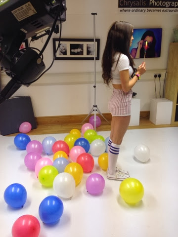
Currently, I am finding different items of clothing, shoes and makeup that we are going to use for the photo shoot on Monday at Chrysalis Photography. Alice and I visited Meadowhall Shopping Centre yesterday to collect props for the shoot including helium ballons, confetti cannons, glitter/sequins, and sweets to put in jars. As we didn't collect all the props we needed, we have decided to visit a local shop tomorrow to collect the rest of the props such as regular balloons and fake eyelashes. We will also be asking the drama department for different props like wigs, roller blades and any other props that we will find appropriate for the set. Below is a photo of the items of clothing and two pairs of shoes that we may use for the shoot.
As you can see the clothing is brightly coloured and generally looks quite 'miss match'. We decided to go for this look as it links well to the style we are aiming for and think the outfits will stand out more if we use this style. We included items such as a play suit, shorts, cami tops, crop tops, a bralet, floral top, cropped bright jumper, floral skirt and a bikini incase we want to layer around the bikini. I think the items of clothing look 'fun' and will link brilliantly to the song and the video, making consistency between the video and ancillary tasks. People may wonder why we have included a jumper, but it is extremely bright and with a pair of shorts will show off the theme we are looking for.
These are two of the pair of shoes that may be used throughout the photo shoot, and I have another pair of orange heels that I will be picking up on Monday. The 'jelly shoes' are bright and will stand out on the photos, with the outfits that maybe aren't as bright as others. The red wedge heels will enhance the outfits, and add the finishing touches to outfits that may need it. The orange heels that I will be picking up on Monday are amazing and will look perfect with every single one of the outfits displayed above. One of our friends that isn't in our group, is lending us a pair of bright blue heels aswell so that we have a wide variety of choice and can provide a range of different styles throughout the photos. Amy and Alice, the other two members in my group will also be searching through their wardrobes to find items of clothing that could be used in the photos. This will ensure that we have more than enough outfits to use in the photos. Below is a photo of the current props we have, but we will be buying more tomorrow including balloons, eyelashes, candy canes, beach ball, and pink milkshake. We will also be collecting some from the drama department on Monday.
Below are some of the different pieces of makeup we will be using, including bright eyeshadows, pale foundation, a range of mascara, bright lipsticks, nail varnish and glitter nail varnish. The eyeshadows in the pallet don't look very bright but by building them up on Emma's eyes, we will be able to make them stand out. Even though we want the photos to be fun and colourful, we want the makeup to be quite 'glamorous' to ensure that we have a sophisticated look, and the makeup is not drawing the audience away from the attention of the props and clothing. Also note, that the colours of the makeup are a lot brighter in person than on the photos.
To style Emma's hair we will be using GHD hair styles to curl her hair, and also a curling wand. This will create volume to Emma's hair and emphasis the look that we want to produce. Below is a couple of photos of the look at we are going for with Emma's hair. We haven't decided if it will be fully down or we will do some sort of style with it but we will decide on the day.
Collecting of props
Alice and I are going to visit the town center later on today to collect props for our visit to the modelling agency on Monday. We have made a list of the things we need to ensure that we get the best out of our photos and relate it to the best of our ability to relate to our music video.
Subscribe to:
Posts (Atom)